 |
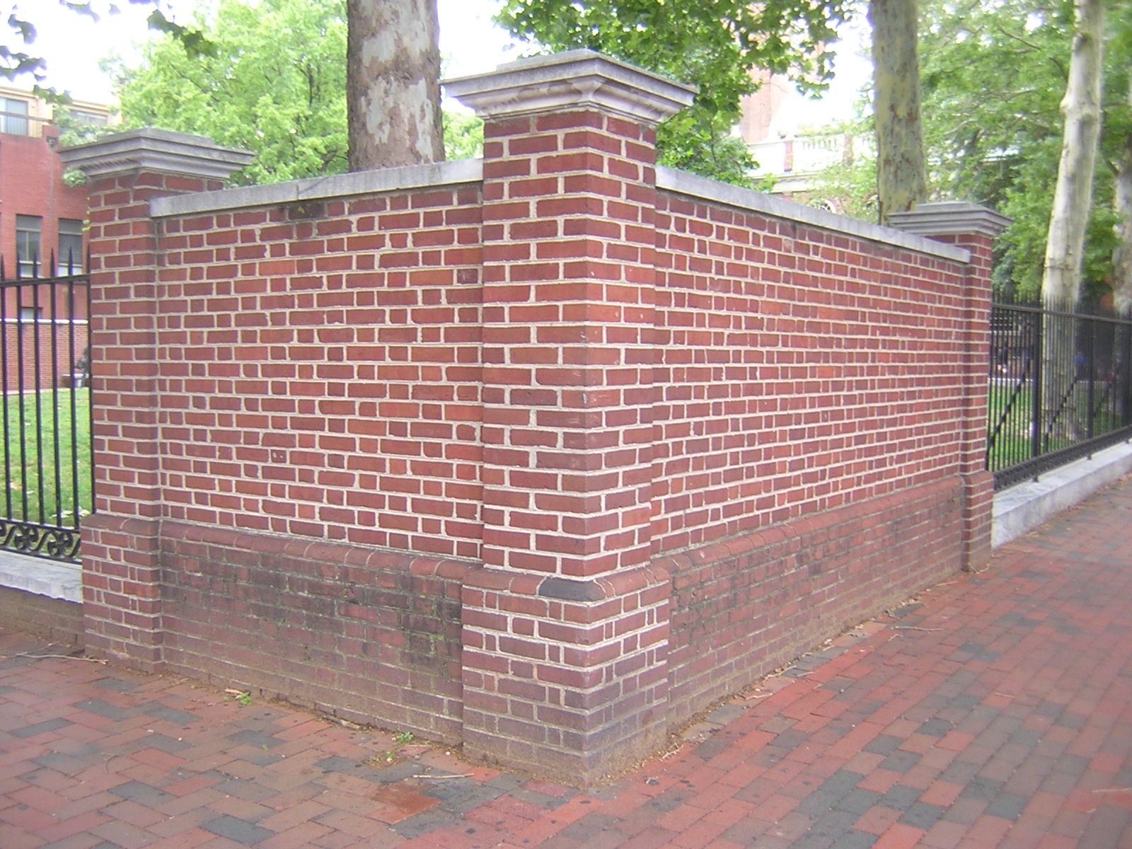
| The corner of Second and Market. No gate. |
So maybe we should ask people to come into the park. Just a thought. It's a nice park - I've often admired it walking by, on either Market or Second, on my way to somewhere else. I've hardly ever gone inside the park, and when I have I wasn't quite sure what to do there.
Let's face it: I've been coddled by Rittenhouse Square, where there are benches, other people, yadayada. Oh, yes, and there are ways into Rittenhouse Square.
How do you get into Christ Church Park? It's almost a secret. Is there an entrance at or near the corner of Second and Market? No. Think about Rittenhouse Square and the corner of 18th and Walnut, with massive quantities of pedestrian commuters in the morning and evening rush, bike messengers hanging out all day, socializing and waiting for their next call, various solicitors for religious, political, and other causes. The occasional odor of marijuana. Nothing like this happens at Second and Market. There's no gate there, you know.
 |
| Gate on Market Street, recessed in midblock. |
There are two entrances to Christ Church Park, and frankly they're almost hidden. There's one on Market in the midblock, at the southwest corner of the park. The other one is at the northwest corner of the park, near the entrance to Christ Church. The two gates are connected by a brick walkway, the only path in the park.
 |
| The Market Street gate and the walkway. |
 |
| Gate on Church Street. |
Urbanist Jan Gehl likes to talk about the invitation. If you want people to come into your park, you need to invite them in. (See Jan Gehl, Cities for People, 2010, pp. 15, 17, 21, 236-237.)
 |
| View from Church Street gate, Christ Church across the street. |
Okay, so let's assume you're in Christ Church park. What do you do then? Good question.
I'm a simple guy. My main park activity is hanging out. I don't need rope courses or zip lines. A place to sit would be nice. The park currently has five stone benches strung along the walkway. They do not have backs or armrests, but they are backed by a brick wall. Here's a picture.
 |
| Four of the five stone benches. The walkway. The brick wall. |
Behind the brick wall, by the way, is a parking lot. It is virtually invisible. I wish all the parking lots in Philadelphia were as demure as this.
 |
| This parking lot is on line with American Street. |
Given the configuration of the park as essentially a pilgrim's path to the church, it is perhaps not surprising that park utilization leaves something to be desired. Dog-owners walk their dogs here, and even that has its ins and outs. This is a National Park Service park, and the Park Service requires dogs to be on-leash at all times. It's in the Code of Federal Regulations: 36 CFR Chapter 1, Section 2.15(a)(2).
Reimagining the Park
I picked up these tidbits at a July 18 meeting in Christ Church's Neighborhood House, next door to the church itself. On the fourth floor, in an auditorium that used to be a gym (there are still basketball-court markings on the floor), I watched and listened as various speakers discussed various aspects of the park.
All this gabbing was in service of a project sponsored by the Old City District: Reimagining the park at Second and Market Street.
Ideas? Yes, I Have a Few
Here are a couple of ideas off the top of my head.
My top priority. Figure out how to get little kids and their moms and dads into the park. You definitely want them in the mix of park users. They bring a whole new and very positive vibe.
Just look at the statue of Billy the Goat in Rittenhouse Square. The goat is the center of a seating area largely but not exclusively occupied by small children and their parents. This place is so popular with kids that, after a century, a literally worn-down Billy is retiring to a nice pasture across the street in the Philadelphia City Institute Library. He will be replaced by Billy Jr., an exact replica.
Second idea. Plan for a mix of uses. In The Death and Life of Great American Cities (pp. 96-97), Jane Jacobs explains the secret of Rittenhouse Square's success. Because it borders a residential district and a commercial district, the park draws different people at different times of day. Aside from small children and their parents, and the old people who like to sit on benches and watch them, you have pale-faced office workers who come to get some sun and exercise while walking on the park's ring path. The benches welcome people eating takeout lunches.
I could go on, but you get the idea.
So here are some physical changes that would undoubtedly make Christ Church Park more popular.
- More gates, better placed.
- Diagonal paths. These would encourage people to shortcut through the park. A valid use to my mind (I certainly do it a lot myself), and some of the people passing through may sit down for a few minutes, rest their feet, and look around.
- A water feature. Philly has lots of great water features, none better in my estimation than the two at Sister Cities Park by Logan Square (talk about child magnets). I personally think the water feature at Christ Church should include a watering trough for horses.
- Interpretive plaques. And here's why we should have a horse trough. Somebody needs to step up and educate tourists and locals about the history of the nineteenth-century city they are standing in the middle of. Explaining to people what a horse trough is could be a good place to start.
Why All the Low-Hanging Fruit?
As I learned at the information session, Christ Church Park is a child of the 1960s. The Park Service wanted to create a view shed for the church, so it pulled down the buildings where the park now is and created a very pretty space that would allow tourists to stand at Market Street, where the sidewalk has been widened and a raised planting bed with low walls appropriate for seating has been provided. (These walls currently sport a don't-sit-on-me rail running along the top.) Tourists could view Christ Church from a distance and then possibly walk on the walkway at the west side of the park to view the church exterior close-up and possibly even go inside the front door, just a few feet from the park's northern gate. Any other uses by pedestrians do not seem to have been in the program.
That's simply how people were thinking then. Take Mies van der Rohe's iconic Seagram Building, on Park Avenue in Manhattan. A product of the 1950s, it stands in magnificent isolation behind a very effective view-shed plaza. Later on, people did get the idea that maybe there should be, you know, people in the plazas, but in the beginning it was definitely look but don't touch. It might be a step too far to say that the only pedestrians welcome were architectural photographers. Or it might not be a step too far.
The view of Christ Church from Market could actually be improved by lowering the fence. New York City's parks department has a program called Parks Without Borders; it does advocate in certain situations for taking down fences entirely. I wouldn't do that here because I think the moms and dads will want some perimeter definition to help keep their little ones from wandering out into the middle of Market Street.
Learning from Love Park
Part of Old City District's reimagining process will be looking at ways to further civilize the streets adjacent to the park.
I watched this mission civilisatrice (as the French would call it) fail at Love Park. I love the new Love Park itself, but nothing was done about the surrounding streets despite promises and hints.
I'm still angry about Love Park, but I'm working resolutely to set that anger aside and focus on the opportunities presented by Christ Church Park. I think, with a little help from well-meaning people, the park could raise its game significantly without spending a lot of money.
There's an open design workshop at the park Wednesday, August 8, from 2 to 7 p.m. The workshop will be at the farmer's market, which is next to the church.
There is naturally a page on the Old City District's website. Linked from the page are a survey and the slide deck from the July 18 presentation. Click here to view.
See Do We Secretly Want Ugly Cities and Dangerous Streets? Also Road Diet by Love Park - a Natural Experiment.


